I'm a little behind in my Quilt University course, Artist's Toolbox. First I went to Retreat then my parents came for a week. The fourth and final lesson will open tomorrow, but I am still working on the second lesson. On Tuesday I thought about just skipping lesson two, but the class stays open 2 weeks after the last lesson is posted so I will still have time to get all my assignments done.
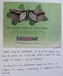
This week (well, the second week) we study color. I'm not going into detail about the lesson. I think you should take the class if you want details. It is a really good class, by the way! The gist of the assignment was to look through magazines and catalogs at the color schemes that were used. I tried to look at the advertisements and think about how they were using color to sell their product. I also looked for color combinations that appealed to me.
These are just a few of the pages I tore out and glued into my sketchbook.
In looking through my stack of torn out pages it was clear to me that I am drawn to blue, green and brown color combinations and any variation thereof. I can't say that this surprises me much. The other thing I noticed was how gray is used effectively. Look at the warm color scheme picture above. That was pulled from a home decor catalog. The wall is painted gray in that room. I tried to think about what other color they could have used. Everything I thought of would either compete with products for sale or blend too much with the products. Light blue would work, but I believe I like the gray better. Gray is also used in the last picture - the rim of the paint cans and the metal basket of lettuce.


1 comment:
Good observation about the gray. I sort of missed that. This sounds like an interesting course. I think I would enjoy it. Glad you are able to get caught up and not miss out on any of it!
I also like in the Garnier ad, how they use just a tiny spot of pink. That's sort of neat, too.
Post a Comment